Goalie
The ultimate campaign dashboard
- Client
Undisclosed
- Role
Designer & Developer
Progress To Goal
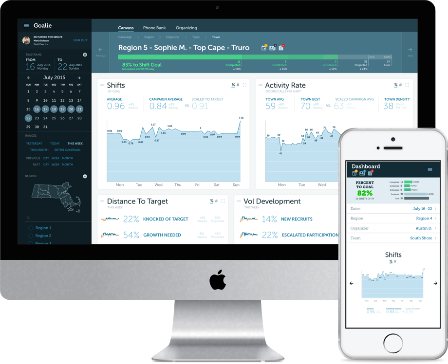
Progress to goal is the quintessential campaign metric for field teams. Existing campaign tools ignore this completely. To fill the void, campaigns rely on legions of spreadsheets to measure progress to goal minute-by-minute. These spreadsheets are deployed in daily staff meetings and monitored constantly by supervisors. Campaigns reinvent the wheel with new spreadsheets every year. Over months, these spreadsheets develop feature bloat, growing larger and larger to present increasing amounts of data. This occurs without rigorous development testing, leading to an error prone dashboard. Finally, visual presentation is constrained by the inherent limitations of styling spreadsheets.
Journey Maps
After constructing personas to identify user types, we created journey maps for each persona to determine our list of requirements and to advise us when thinking about information hierarchy.

Requirements
- suitable for projecting in front of a staff meeting
- provide tools for staff management, such as highlighting missing reports
- tie in to RP and ES for event reports and volunteer signups
- provide an interface for administrators to set goals
- offer at-a-glance performance assessment of staffers and of the campaign as a whole
- provide basic projections thru end of week to inform staff conversations
Solution

Progress to goal at a glance; breakdowns by shifts scheduled, confirmed, and completed
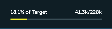
Overall percentage of target knocked is always available at a glance
Graphs, Tufte-Style

- sparklines maximize information density and provide at-a-glance indicators of progress to goal for every metric
- no chart junk, labeled data points and minimal ornamentation
- graphs measuring recruitment, activity rates, and volunteer outcomes

Toggle every metric between absolute and relative values
Filters that understand field staff hierarchy, structured for daily standups: iterate through regions, organizers, towns, and teams. Compare in seconds.

Full Dashboard
