Aashiyaan
prototyping, user research & design for react native app
- Client
Anandana Kapur
- Role
Visual & Experience Designer
Summary
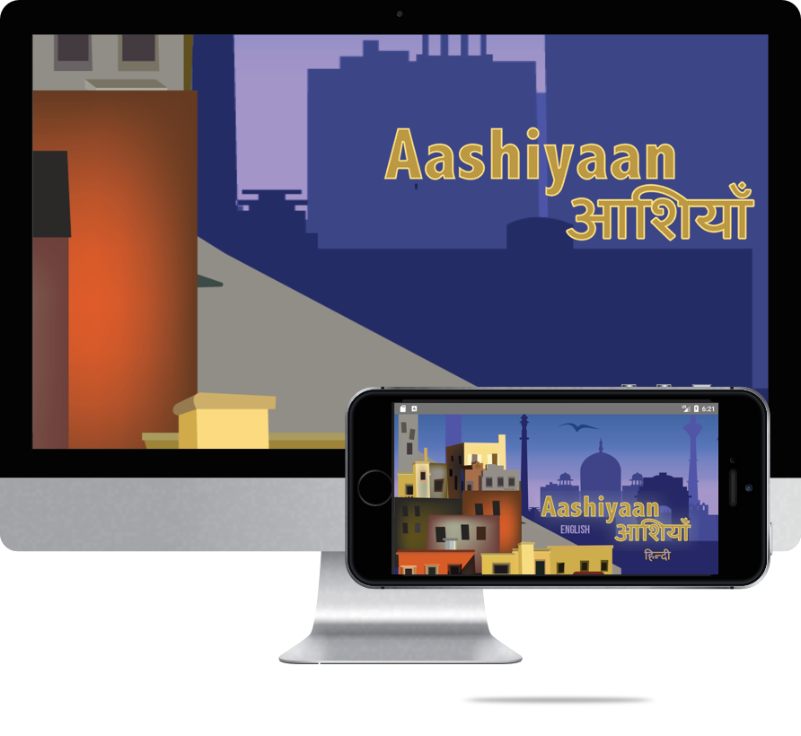
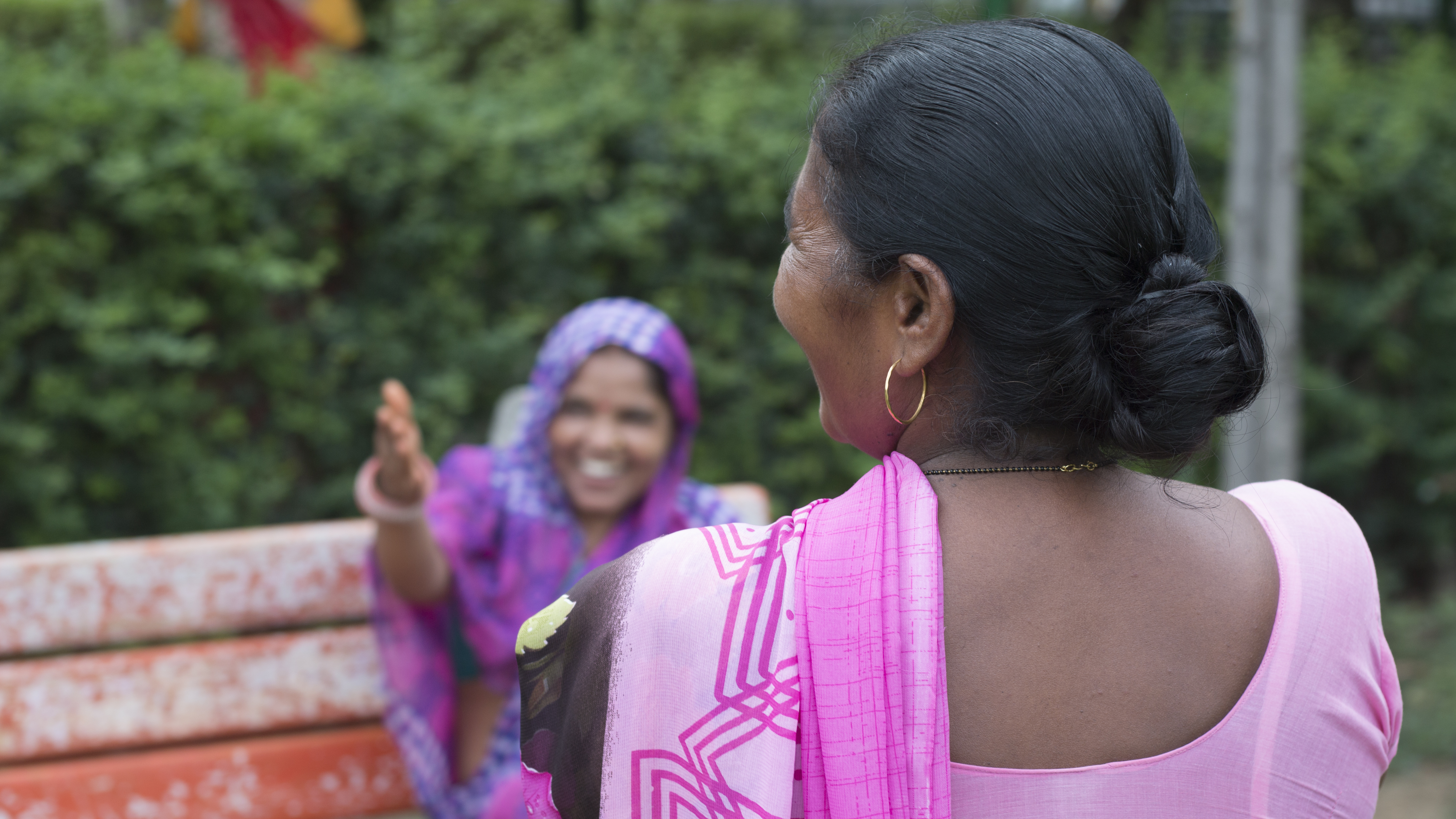
Aashiyaan is an interactive mobile documentary that is a living archive of the lives and experiences of the ‘invisible’ women of Delhi. As an interactive mobile app, it invites users to listen to and participate in women’s conversations about how they navigate unsafe urban geography.
—Challenge: user research across two continents—
Research Goals
High Level Questions
Do users want to follow individual women's stories? Or are they happy seeing the icons representing concepts? Do users connect concepts with the icons? Do the Objects icons provoke curiosity?
User Research Process
- Working to a script
- Reviewing notes with the participant
- Reporting positives & pitfalls
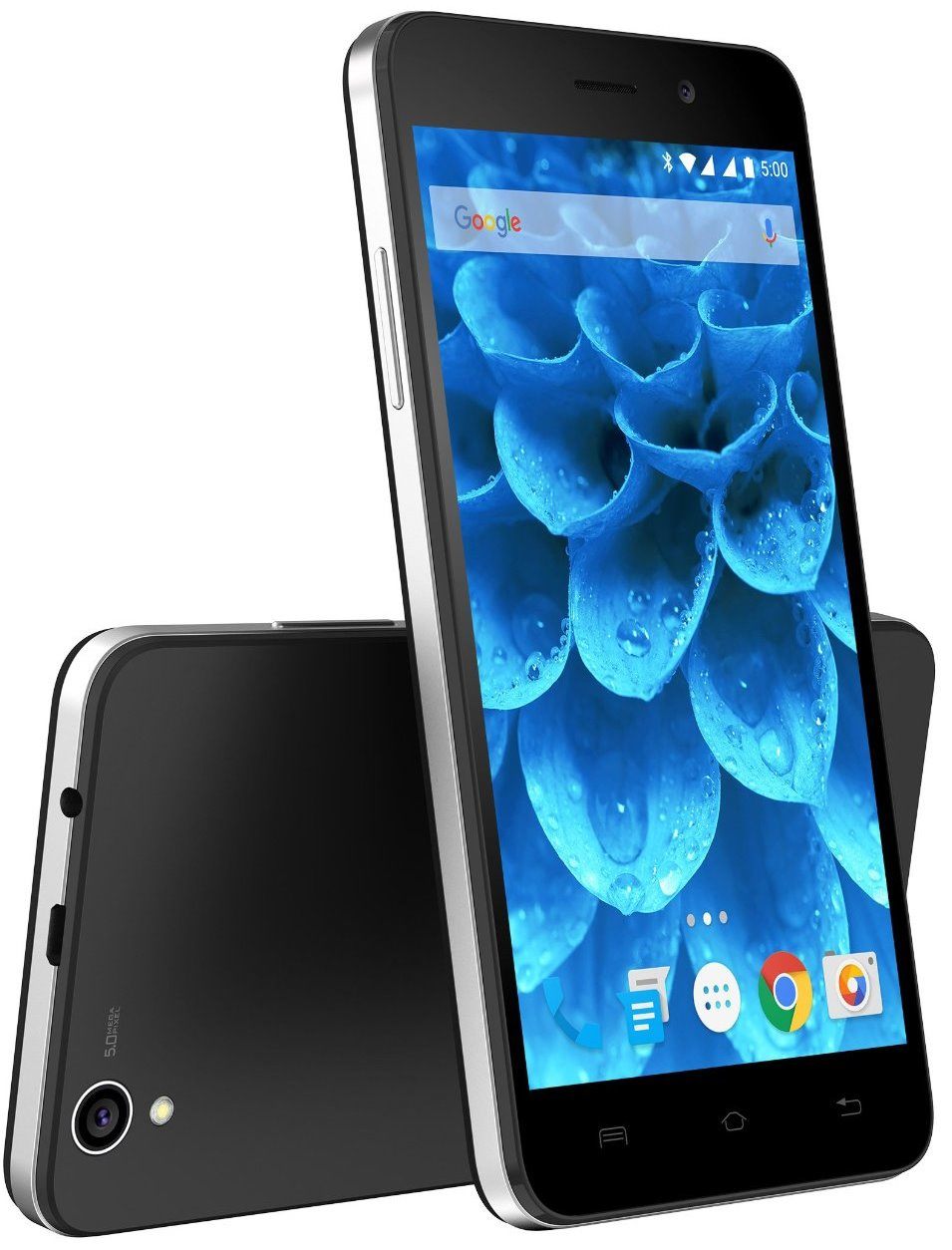
Production Decisions
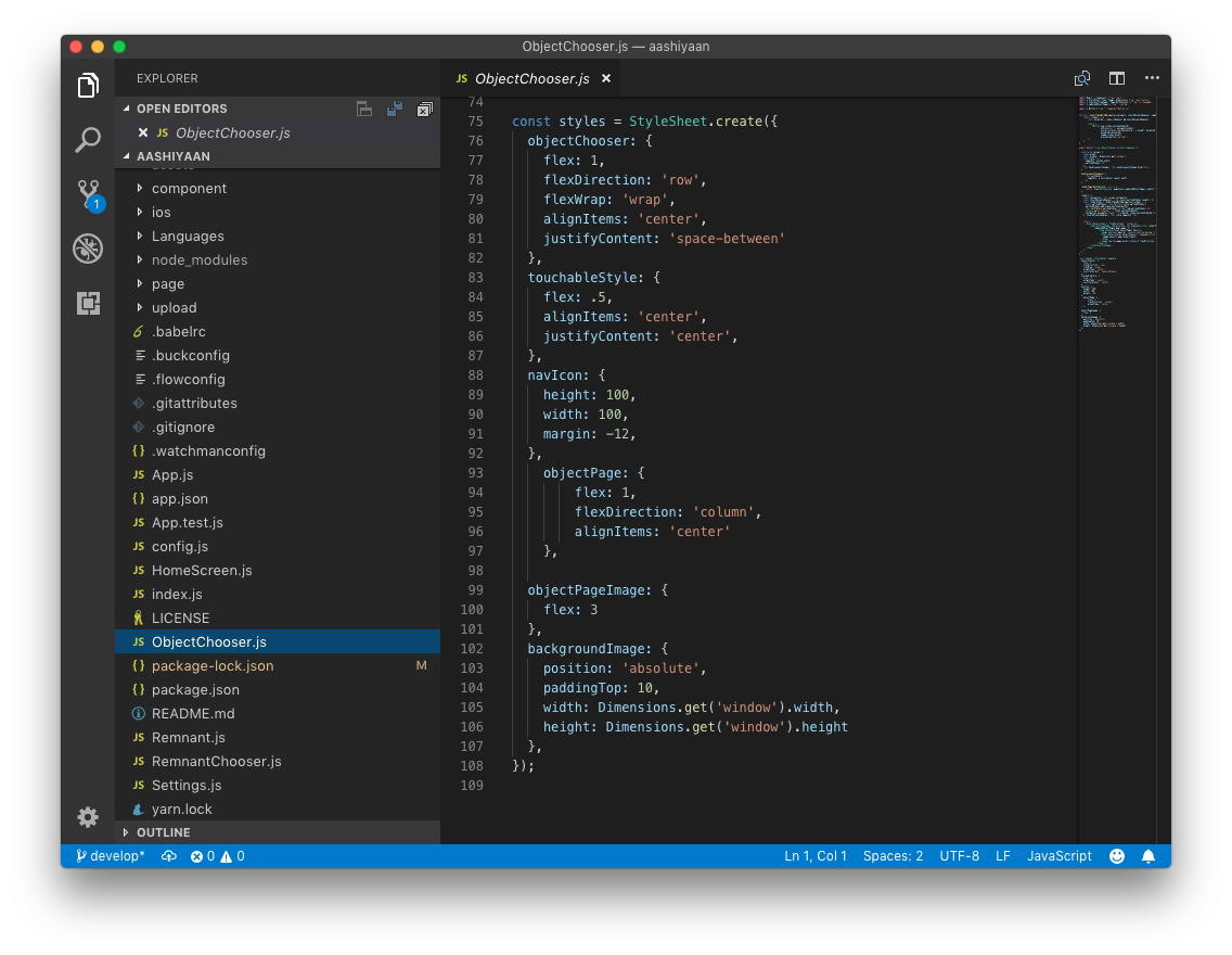
Our design and development teams were partners in a discussion about how to style the app in production. We ultimately elected to use the react-native default, where styles would be defined in the .js component files in regular JSON. This is a step away from the global style definition style of the design system as written, but dramatically reduced design-related unknowns for developers working independently.
Lessons Learned
Get Closer to the Code
We got the best results when the outcome of our design process was easily incorporated by developers and other non-design stakeholders. Clear action items based on research findings and component-level Javascript styles are two examples of this principle that we put into practice.
Test Early
Our team firmly believed in the need to conduct user research early and often in the design & development process, and we were rewarded with research findings that challenged high-level assumptions made while prototyping the visual design and interactions.
Explore New Tools
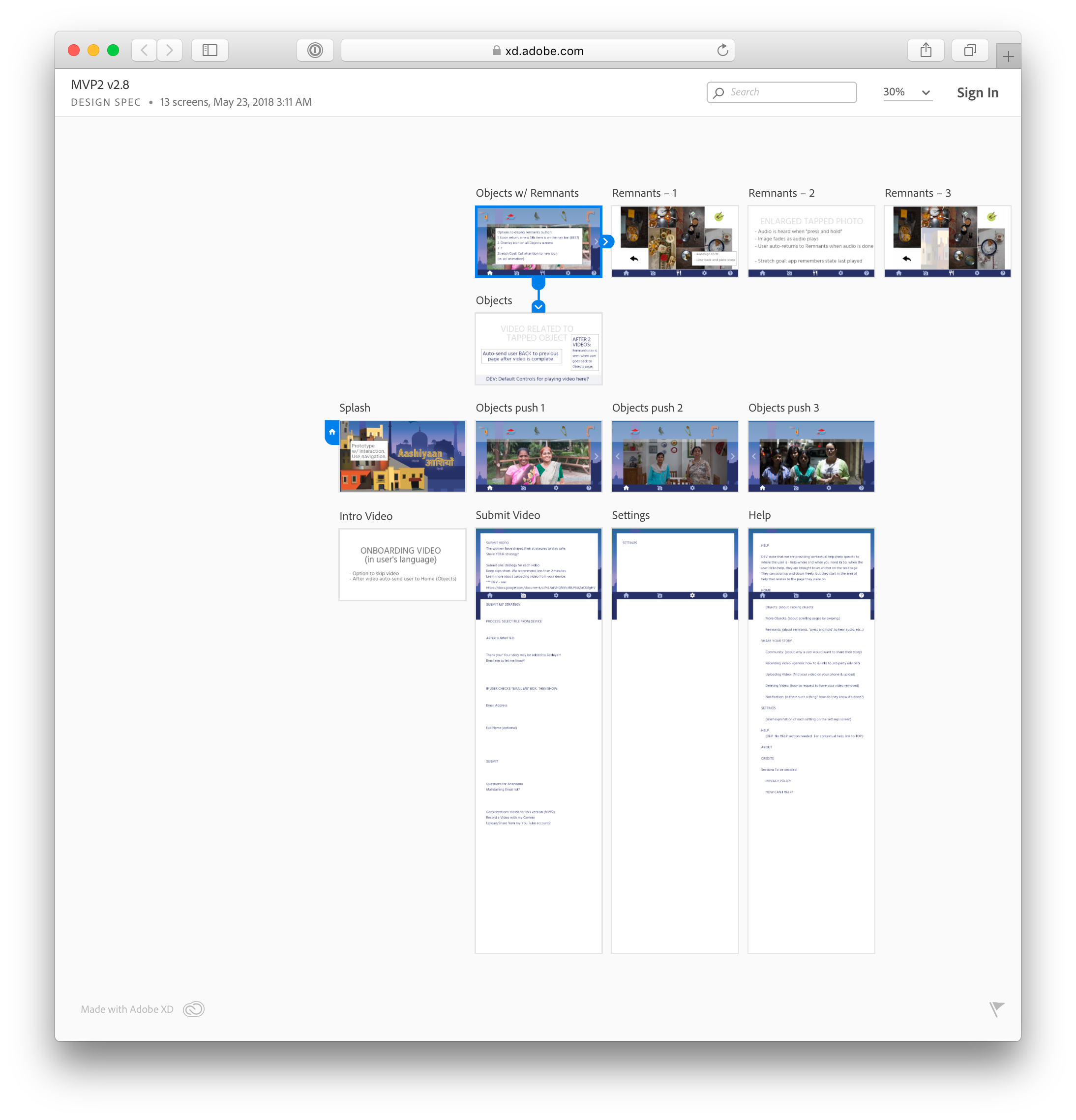
We found that prototyping in Sketch and XD was sufficient for designers working independently and in sequence, but wanted to explore other applications providing live collaboration and multi-user support—in addition to tools that could output production-ready CSS or JS from a familiar interface.
