Armano
design system & component library
- Client
Mike Armano for State Senate
- Role
Designer & Developer
Summary
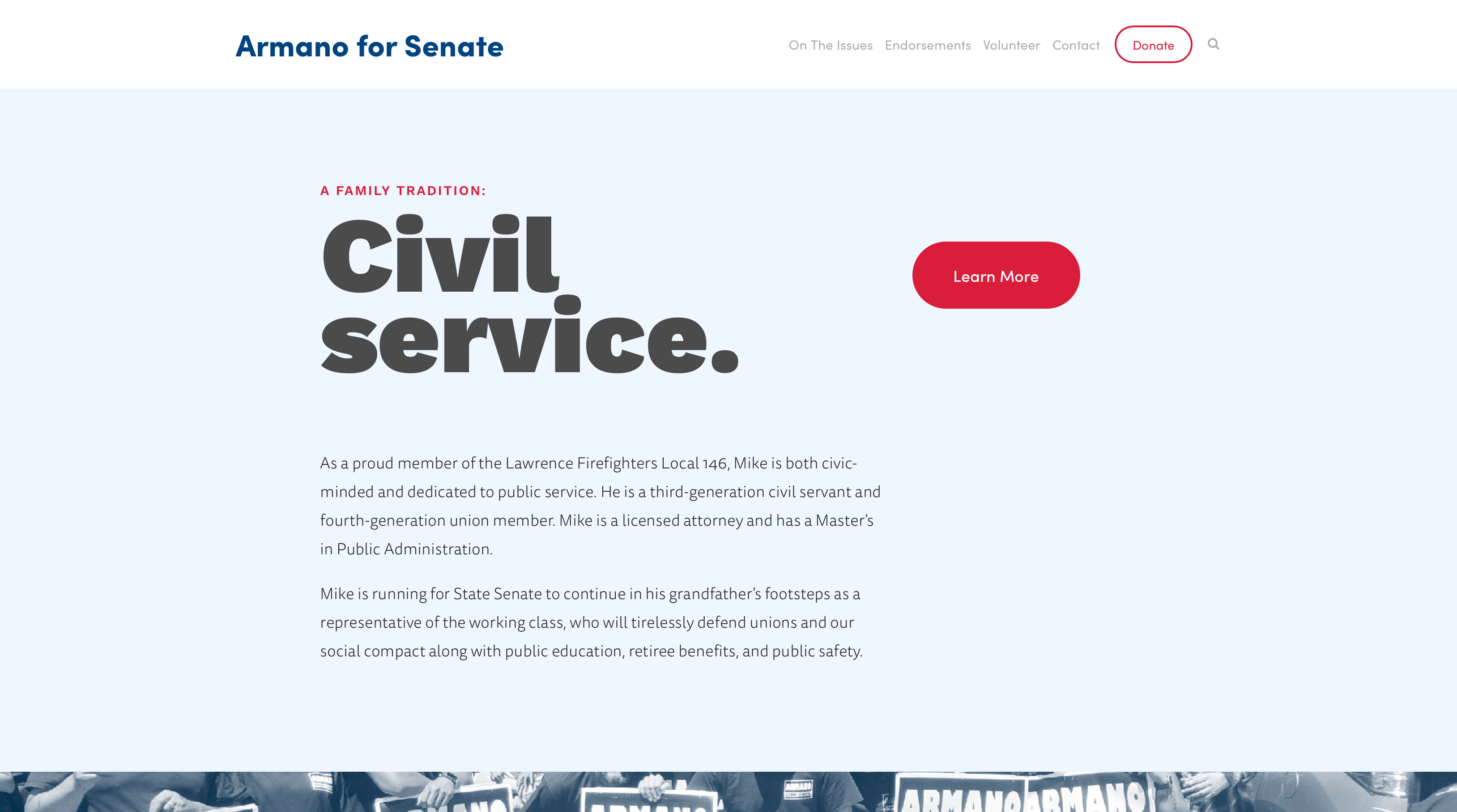
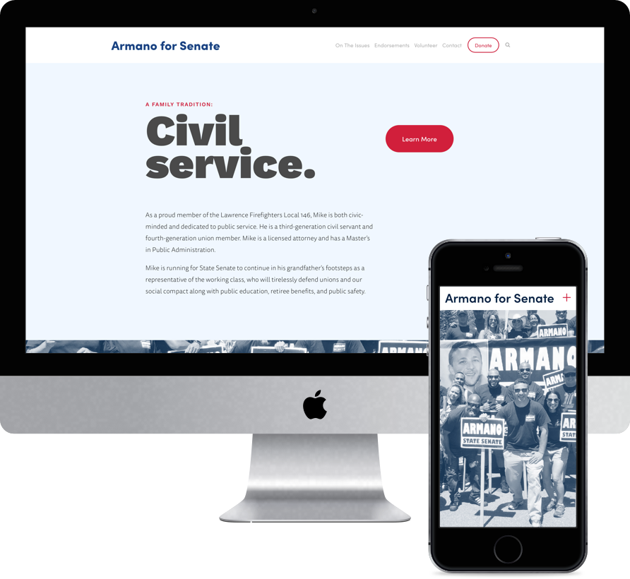
For the Armano campaign, I created a design system that covered print, digital, and multimedia designs and an accompanying component library for the web that produced a best-in-class solution for a Massachusetts Senate campaign.
—Challenge: take a single existing design and build a system—
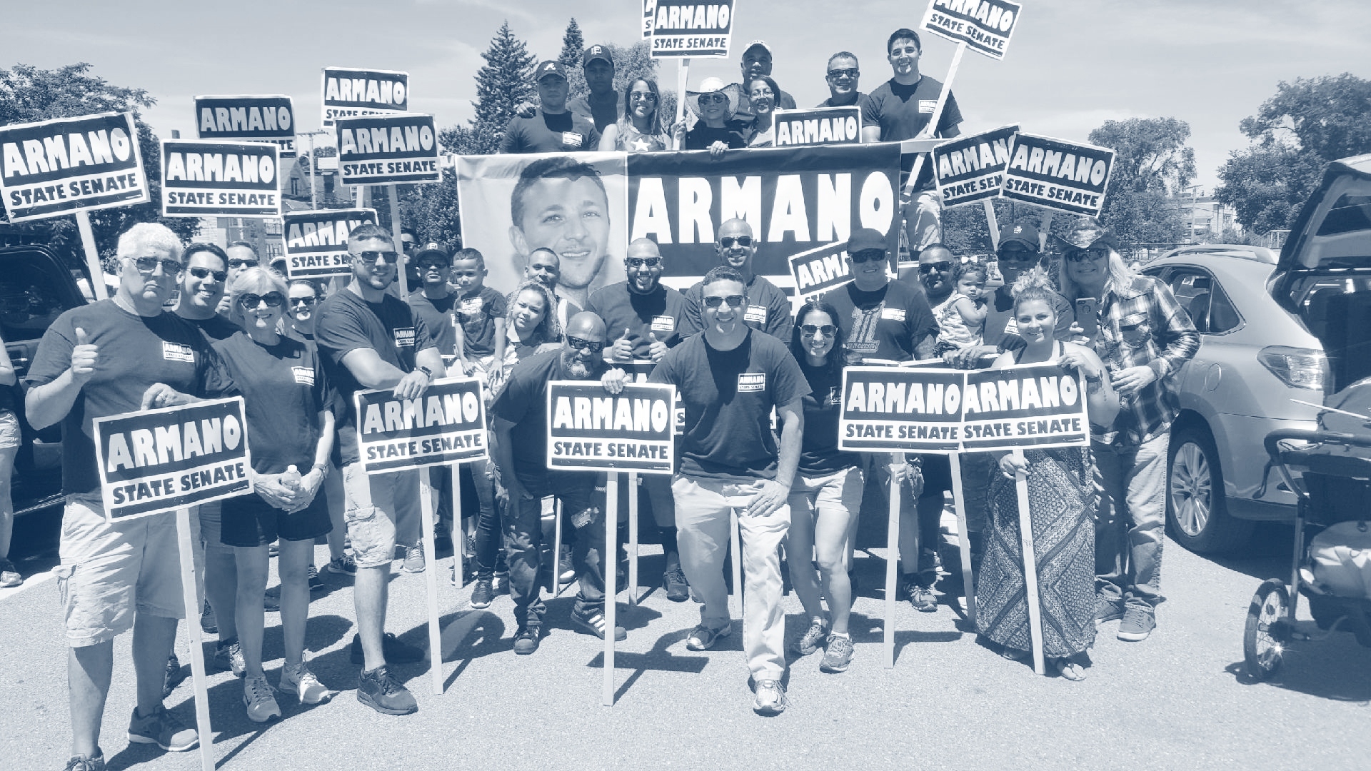
Before: A Logo & Nothing More
When I was brought onboard, the only existing design artifacts were the campaign’s lawn signs and a derivative logo adapted from the same graphic. Constrained by the lawn signs and a tight deadline in the form of our primary election on September 4th, I took took the logo and refined it.
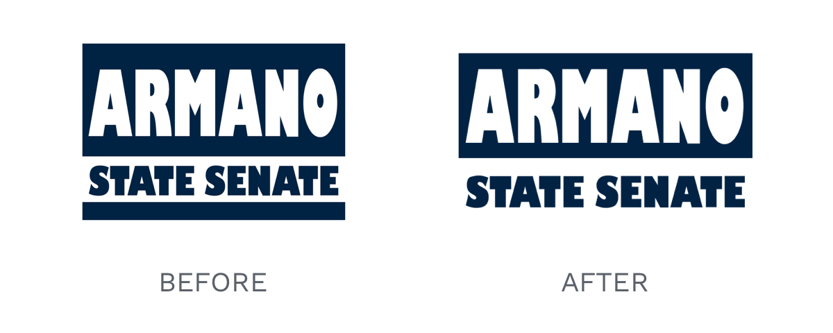
Iterating on the Logo: Making a Mark
I made some obvious improvements to the logo without making it indistinguishable or unrecognizable. We confirmed this by testing it alongside the existing logo with voters who had seen the mark before and who had not seen the mark before. Ultimately, this was an evolution rather than a complete overhaul. I took the simplified, evolved logo and made it into a mark.

Expanding the Branding [Guidelines]
With the mark in hand, the next areas of branding to be developed were the typography and color—both anchored by decisions made in the original lawn sign design, that now needed to be expanded beyond. I added a modern sans serif (Work Sans) for display use, replacing Gill Sans Ultra Bold, and elected to use the more readable FF Tisa Sans for body type on the web.
Heading 1
Civil service.
Heading 2Get Involved
h1 {
font-family: "Work Sans";
font-size: 7.5rem;
font-style: normal;
font-weight: 900;
line-height: 5.625rem;
}
h2 {
font-family: "Work Sans";
font-size: 2.5rem;
font-style: normal;
font-weight: 600;
line-height: 3rem;
}
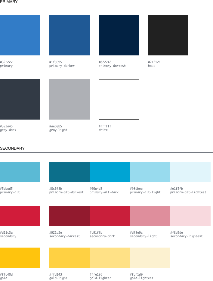
To establish the color palettes, I took the non‐negotiable Armano Blue from the original efforts and paired it with white & a light tint that met WCAG AAA standards to form the primary palette. I found a complementary gold, and used it along with an attention‐grabbing red and a blue known locally as "Dracut Middies Blue" to form the secondary palette.
Components for the Web
The narrow scope of the campaign website allowed me to create a reusable component library while working as the only developer on the project with short deadlines.
.button-element--large {
font-family: "Work Sans";
font-size: 1.09375rem;
font-weight: 500;
text-decoration: none;
border: 0.125rem solid #d11c3a;
border-radius: 18.75rem;
padding: 1.5625rem 2.875rem;
color: #fff;
background-color: #d11c3a;
}
.button-element--nav {
font-family: "Work Sans";
font-size: .890625rem;
text-decoration: none;
border: 0.125rem solid #d11c3a;
border-radius: 18.75rem;
padding: 1.5625rem 2.875rem;
margin: .618rem .45rem;
color: #d11c3a;
}
Results
The website I constructed from this component library allowed the Armano campaign to quickly mock up, code, and deploy new layouts to respond to developments such as new organizational endorsements and fundraising drives.
