Health & Safety UI
User interface modernization
- Client
SciSure
- Role
Designer & Developer
Summary
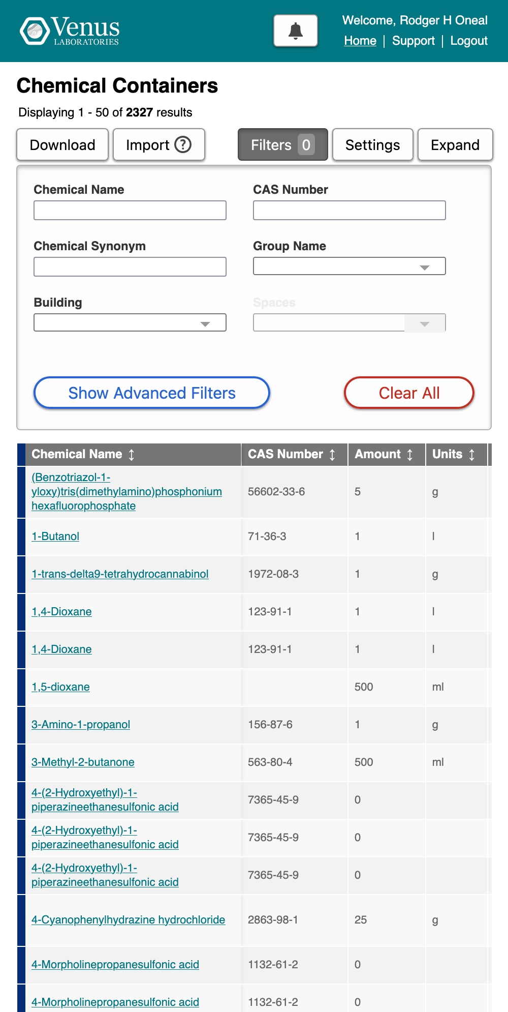
A top priority of mine at SciSure has been bringing the benefits of responsive design and design systems to our legacy interface. I took an iterative approach, starting from the elements users were familiarized with already and preserving accessibility while introducing greater options for differentiation — more than one style of button to distinguish between primary and secondary actions, clearly identifiable destructive actions, and an improved typographic hierarchy. It was critical that we extend this work beyond the planned migration to our next-generation "Version 4", due to the extended timeline required to complete that work.
Outcomes
- Responsive full-width theme enabled for 100% of customers
- Prioritized company brand and broadly unified appearance of 2 product lines
Scope
I produced a front-end design system and implemented it as VueJS components with the help of another front-end developer. We removed the fixed-width constraints of our current Drupal theme, and brought all of our customers onto a single new color scheme representing the SciSure brand. We continue to move towards a new, unified design system of VueJS components that will be shared between our compliance and research products.
Process
There have been four phases to our interface modernization project: our early steps, the move to a component library with a light background, brand unification, and adoption of a unified design system. Shortly after I started at SciSure, I recommended conservative changes to common elements (buttons, links, typography) in all "new work". An iterative approach allowed us to avoid alienating users with frequent large changes that would have appeared inconsistently throughout the app. I concentrated on differentiation, depth, and color.
Before
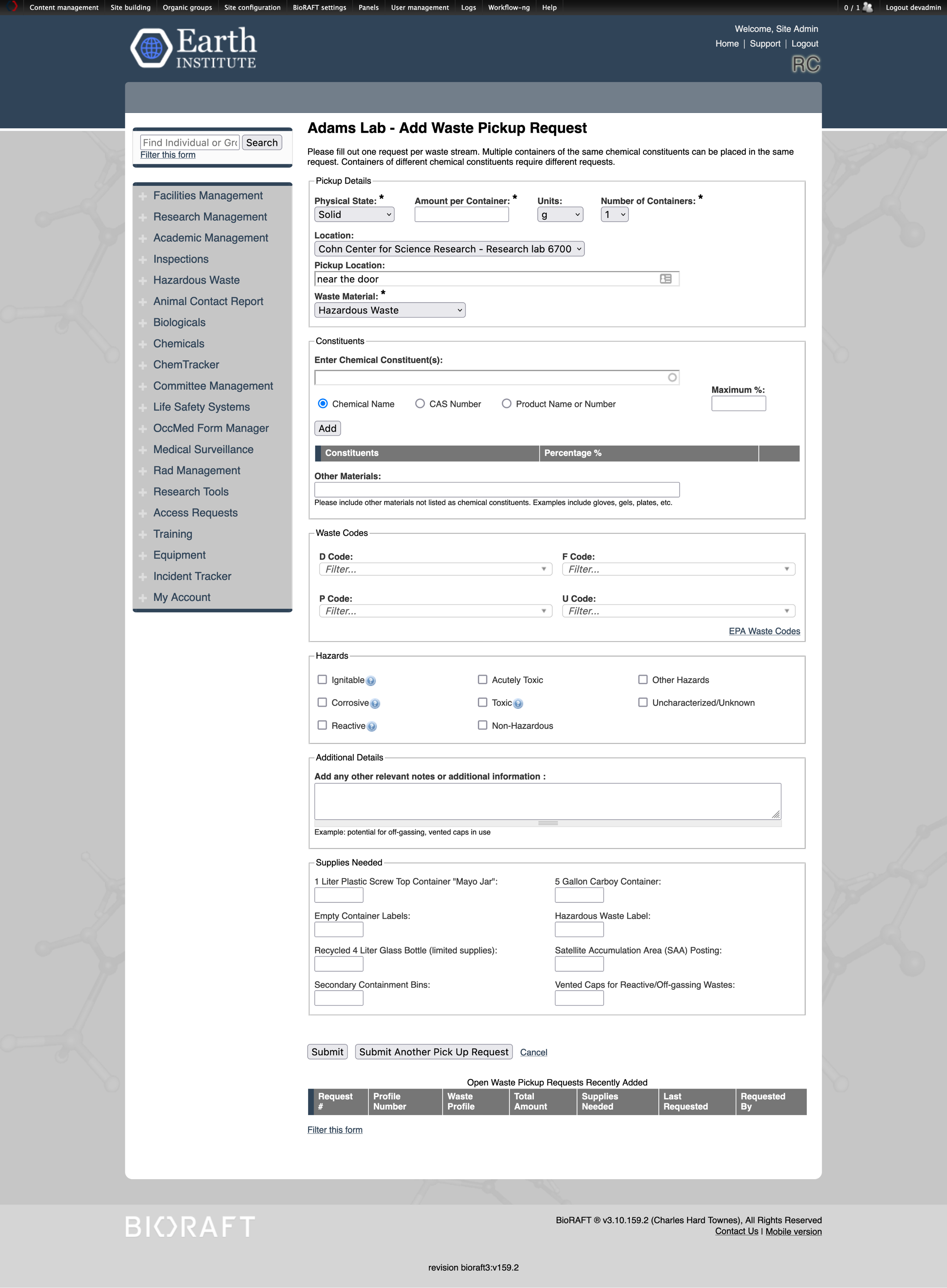
The previous UI featured small type, native form elements, and a weak hierarchy. I adopted a lighter gray for improved contrast, introduced depth with borders and shadows, and increased the size of both interactive elements themselves and their tap targets. The interface had previously not distinguished between primary and secondary options, and destructive actions were not well-indicated, so introducing semantic colors was another easy win.
Branding and Hierarchy
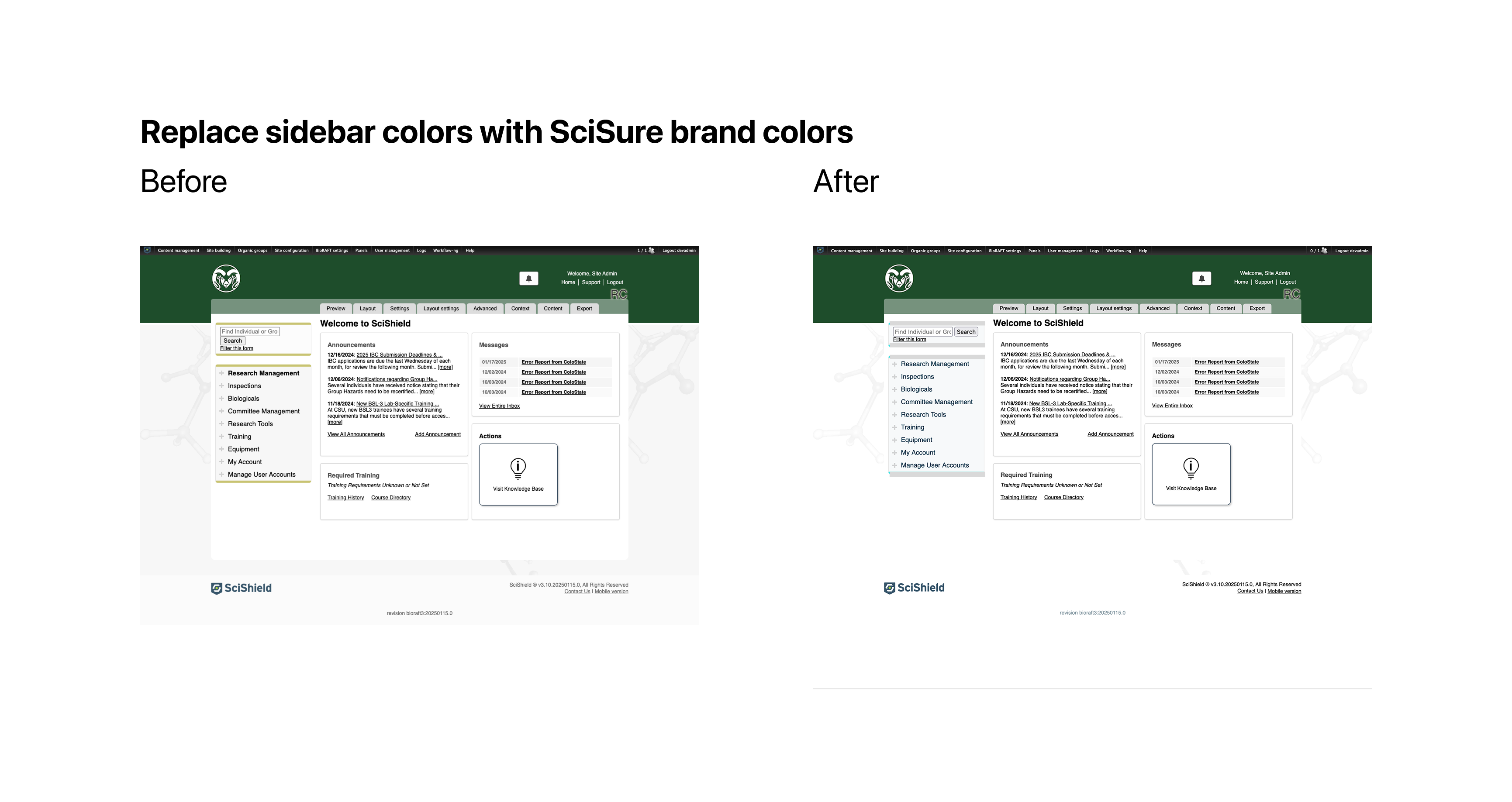
![A before and after comparison of a customer site featuring a red header. It is titled 'Use single background color [#FFF] from ELN (SciShield)' and has two screenshots labeled 'Before' and 'After'. The 'Before' screenshot has a red header above a white content area centered above a mid gray background, while the 'After' screenshot has a red header above the same white content area center above a new, white background.](/assets/ui-light-bg.png)
One of the challenges we faced was indiscriminate customer branding applied to almost every site, without advance planning or the team size to support it. As a result, introducing additional color in the UI was difficult — many options would clash with a simliar hue on at least one customer site. I persuaded stakeholders to take two smaller steps to ease the path toward better differentiation through the use of color. First, we drained the "mid gray" backgrounds in use on ~30% of customer sites and moved to a lighter background, which improved color contrast of links in the primary navigation and gave the product a more modern appearance. Second, we agreed to drop the use of customer brand color in links and adopt a primary interactive blue. This brought us closer to the platform — native links are blue — and avoided the challenges of designing for destructive actions while competing with customer brand red.
Responsive Theme
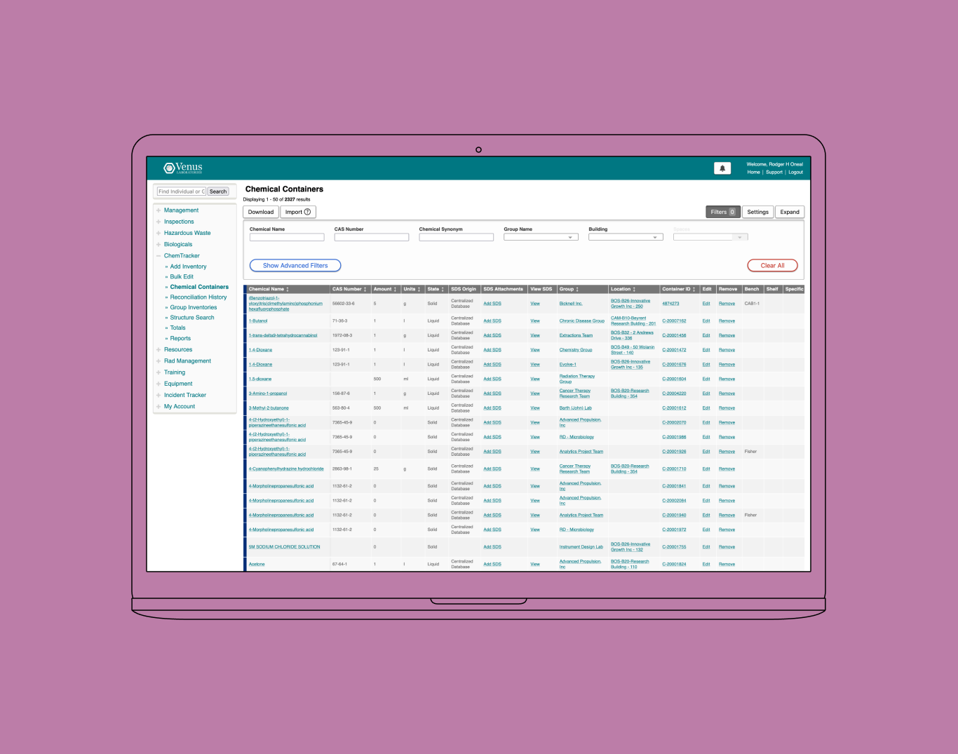
The merger of SciShield and eLabNext into SciSure provided an opportunity to prioritize the company's brand while unifying the appearance of our two product lines, at a macro level. We chose to release the full-width theme at the same time, increasing the amount of space dedicated to content and liberating interfaces with tabular data from the narrow widths of the previous theme.
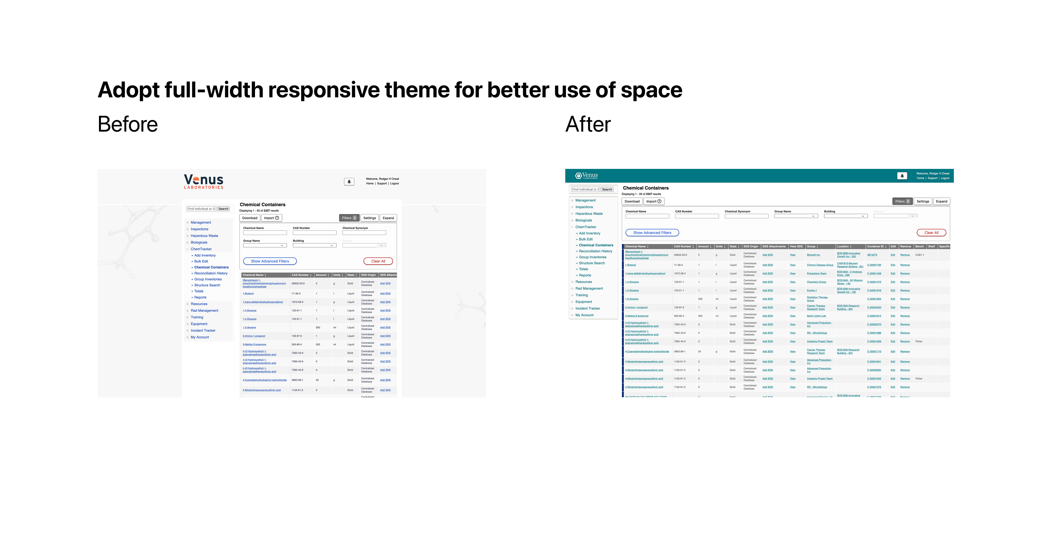
We chose to collapse to a single column layout grid at mobile widths, allowing us to retire our dedicated but divergent mobile theme and concentrate on testing our front-end output on various screens in a single theme.